ROC Curve
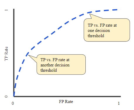
A ROC (receiver operating characteristic) Curve is a graph showing the performance of a classification model at different threshold values. On its X-axis we plot the FPR (False Positive Rate) and TPR (True Positive Rate) on the Y-axis.
TPR is a synonym for recall and is defined as follows:
FPR is defined as follows:
Now, a ROC curve is a graph of TPR vs. FPR at different classification thresholds. Lowering the threshold classifies more items as positive, resulting in more True Positives and False Positives.
To compute the points in a ROC curve, we could evaluate a logistic regression model multiple times with different thresholds values, but this would be inefficient. An efficient method would be to use, AUC.
AUC: Area Under the ROC Curve
AUC generally means Area under the Curve. But here, we mean Area Under the ROC Curve (the same which we did in the 12th class’ integral calculus).
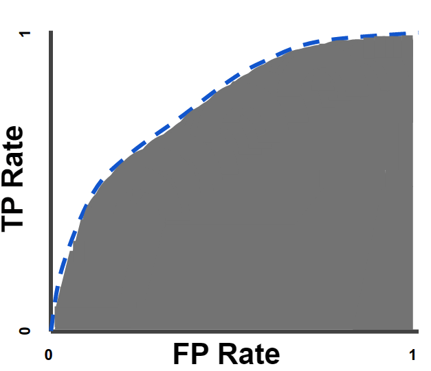
AUC provides an aggregate measure of performance across all possible classification thresholds. One way of using AUC could be to compare two classification models (not necessarily logistic regression… e.g. one could be logistic regression and the other a decision tree). The model with a greater area under the curve can be considered a better model.
AUC value ranges from 0 to 1. When a model has 0.0 AUC it predictions are 100% wrong and vice versa.
Advantages of AUC:
- Scale-invariant: It measures how well predictions are ranked, rather than their absolute values
- threshold-invariant: It measures the quality of the model irrespective of the threshold.
Note: Above advantages may or not be desirable for your use case.

Leave a comment